Tuesday, August 25, 2015

Less is More Challenge

I saw this over on Darnell’s blog and something about the slanted edge just caught my eye.  Mission:  make a card using this sketch.  Wait, what? It’s from Less is More, have I ever played in one of their challenges??  scratching my head…I dunno, I don’t think I have.      LIM Sketch 16IMG_7978 (847x1024)

Using a curve from the Spellbinders dies I placed a pierced curve of Dark Chocolate from MFT as a border.  Not sure why the upper part of the card looks light brown.  I used the same choclate to die cut the Wishing sentiment from Simon.  Added the hearts in Memento brown and voila` we have a card for this challenge.  Love the simplicity of it.

no stamps

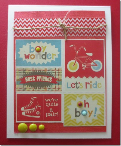
Simon Says Wednesday challenge is Back to School with My Mind’s Eye products.  I had this Boy Crazy 6x6 pack of paper and some My Mind’s Eye’s enamel dots.  Interesting enough, I had never even seen enamel dots until I won a little challenge on Simon’s Blog (seriously you can get your name in a drawing just for commenting on their posts)  Well that was a fun discovery and now I lots and lots of dots.   Thank you Simon.  The primary colors and the little stamp like images are so boyish and back to school. 

IMG_7977 (850x1024)

Sunday, August 23, 2015

#510 Hero Arts

I picked up this Hero Arts set at a discounted price at my fave brick and mortar stamping store.  The Stamp Shoppe in Weston, WI.  I know the large letters are so passe` now but I still like the look and I never gave in and bought them when they were all the rage.  The flower is from the same set and I was so glad to have my MISTI to re-ink and re-ink that flower.  To hurry things up a bit I just used a piece of designer paper instead of sponging my own back ground.  A piece of teal cardstock with one of my few working Martha Stewart punches was the perfect set off for this. 

IMG_7971 (901x1024)

A bit of Citrus with a twist

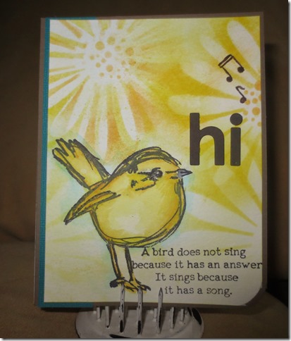
Simon is showcasing Tim Holtz new color Citrus with a twist.  I don’t have that color yet but I do have this gorgeous mustard seed which looks kind of citrysy, right?  I used both the marker and the mini cube to achieve this look with a stencil.  I added in a touch of dried marigold for a bit more citrus.  I always have fun with the Simon Says ChallengesThis is Monday’s challenge.

IMG_7968

MFT Chrysanthemum Girl

I’ve gotten lots of use out of this sweet little Autumn girl from MFT.  Today I am following the sketch challenge # 242 over on the MFT BLOG.  I sure do like the look of the little pattern around these dies.  Everything but the DP and inks are MFT.  My Favorite Things, for sure.

IMG_7963 (593x800)

Playing a bit of Catch Up

I still want to keep up with the ABC Christmas Challenges.  I am working backwards now and trying to make cards for the challenges I missed.  I think the last one I did was J.   Since the Q for the current Challenge stands for Quantum Leap, I thought I would choose the challenge of Lyrics to be my Quantum leap backwards and choose my own challenge.  ~~I do know that none of that makes any sense at all unless you have read the challenge yourself so hop on over to the ABC Christmas Card Challenge and have a look.  As part of the catching up process I am also posting my die cut Santa for the M for Magical.  I am only entering the Lyrics card into the quantum challenge.

IMG_7976 (895x1024)

I used some Inka-Gold paste and worked it into some transclucent stencil paste.  I’ve been playing with my stencils a bit and this sun ray from Ranger-Tim Holtz was perfect for this project.  I stamped the music onto cardstock and distressed it a bit with tea dye distress ink and then added the holly in distressed colors.  This is an old retired set from Mark’s Finest Papers.    Here’s my fun Santa card for M-Magical

IMG_7972 (1024x808)

Sunday, August 16, 2015

MFT School Color Saturation

It’s cool to be in school.  Such is the way I feel after taking the color classes with MFT.  Today’s card uses cool colors and also it is low saturation.  Explained like this in our class.  Low saturation means less of the pure color because of the addition of white or gray. A baby card would probably use softer, less saturated colors, while birthday cards often tend to use bright, highly saturated colors. I have layered light grays and light blues with hints of gray in them.  I loved this Authentique paper that fit my color scheme perfectly.  I needed a bit of creaminess so the water color paper wouldn’t look out of place with it’s yellowish colors.  The border of this paper just fit ever so nicely.  Come join the FREE classes at MFT and see if it’s cool for you to be in school with us.   I rarely craft with low saturated colors.  As my husband said to me the other day, something was too vivid!  GASP…I said, is there any such a thing???!!!  Surprised smile  It was quite a challenge for me to “lighten up”  but a good learning experience. IMG_7961 (730x800)

Saturday, August 15, 2015

MFT School Soft and Hard

IMG_7959 (781x800)

For this lesson from MFT School I learned something I had never thought of.  That is to balance your creation with both hard and soft elements.  I may have been doing this without thinking of it but it was interesting to KNOW the concept and work from there.

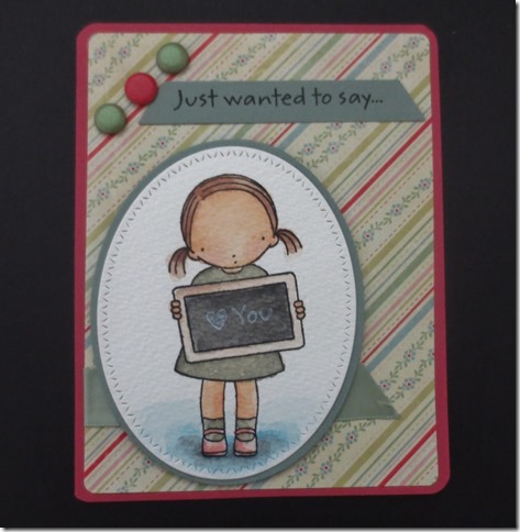
The designer paper is both hard and soft.  It has definite lines softened with lines of flowers.  The image itself has both elements.  The little Pure Innocence girl has a very round soft head, her dress is soft, but she is holding a rectangle (hard) and the  board itself has physical properties of hard.  I softened the diagonal lines by using an oval with hard design around it (MFT dies) I added candies that are circular-a soft element- and the banner with triangular lines a hard element.  The bottom of the card is balanced with a soft ribbon cut on the diagonal-hard element.  It was so fun to THINK about these things as I was creating.  Thanks MFT.

MFT Summer School

Sometimes we forget that all we need is a simple creation to convey a very thoughtful message.  I want to do more of these simple cards to have on hand for those moments.  Thanks to MFT for their class on Symmetry/Asymmetry  I chose symmetry for this simple card. I used the border from a previous die where I had used the center part of the brown card stock.  It worked well for the border.

IMG_7958 (671x800)

SUMMER SCHOOL with MFT

Another MFT class I tapped into this week is all about color temperatures.   Today my entry is with a card that uses cool colors.  Yes there is some warmth in the color of her shirt, hat and flowers but the most obvious parts are cool.  This is why I chose the gray color to put the shadow around the image.  This image was gifted to me years ago and I don’t have any idea who passed it on but I do think it is so sweet.  I mounted the embossed teal background paper onto a piece of cream cardstock to give the paper some sturdiness.  I punched the edge to soften things up a bit.  I then used dimensionals underneath that piece to give some height variation.

IMG_7955 (800x616)

509 MFT– Tree Swing

Finally having some time to take a look at MFT’s summer school.  I thought I would start with their latest and work my way backwards.  That allows me to take part in submitting an entry.  I appreciate these basic classes and find I am learning a lot even though I have been stamping for thirteen years.

Head on over and and join in the fun.    One of this week’s class covered REPITITION  The stamped images and the dies are all from MFT. I chose the Coffee Sentiments to create my repetition.   I see my sentiments got a little bit crooked when I placed them on the acrylic block but……hey, it’s home made and the guy it’s going to won’t mind a bit.  If it was another stamper, I’d likely re-do it.  LOL

Tim Holtz stencil worked well for this theme.

IMG_7956 (628x800)

506-507-508 Mark's Finest Papers mini set.

I have had this little gem of a set for at least three years and have never used it.  I have used the bird and that is all.  It was such a fun little set to do water color with.   The spot below the sun looked kind of bare and I thought the tropical ribbon cut pieces added a nice touch.

IMG_7941 (800x637)

#502, 503, 504,505 Stamps by Judith

I really should just take a day and only play with my Judith stamps to see what fun scenes I could create.

IMG_7925 (747x800)

#502 more tags

this was for a SCS Dare To Get Dirty Challenge.  Not my best work but not my worst one either.  LOL  Just simple.  It’s in the mail already.  I did enjoy stacking up the LOVE sentiment and the little button covers up a smudge.

IMG_7922 (629x800)

#501 Dragonfly

IMG_7921 (627x800)

I distressed the edges of this and added a bit of Washi tape.  I was following a sketch.  First time I found a use for that particular Washi, I think.

colorful snow man #500

Drum Roll….here is stamp number 500.  a retired set from SU that I purchased at a rummage.  I have gotten a lot of use out of these tags once I finally purchased the tag punch.  Open-mouthed smile  it helps a lot. IMG_7919 (641x800)   I sent this to a friend who has an August birthday but she is such a winter person!!

Tuesday, August 4, 2015

oh my, it’s been a full month already

And sometimes things happen in life that just upset the entire apple cart.  In the middle of picking up some of those apples I was able to get a couple of cards made but no time for blogging, or uploading them to FB.  But whatever, it is what it is.  LIFE, that is.  At this time, the apple cart has not been re-loaded nor fixed.

I will post the cards I made and see if I can remember which ones I actually made with stamps that get the little green dot.  You know, as in number whatever it is from my stash.  I am so glad I didn’t set myself a limit, like I’m going to go through all my stamps before I purchase another.  oh no siree, I have continued to purchase and win new stamps and receive gifts and so my collection keeps growing and I will NEVER be done numbering how many I have.  SIGH…now it seems like a big job.  But that’s okay, I enjoy the process and especially when I do get to sit down and stamp these days.  Like right now, I could be stamping Who me? but instead I decided to blog and catch up a bit with the behind the scenes part of this journey.  Let’s see if I can remember where I left off.  The last post was July 3.  let’s see, the shopping lady would be stamp # 496, the cherries would be #497, the light house and gull on the post would be #498 and #499.  Oh. HOORAY, I get to dig around and find stamp #500 to use next.  The other images on this page have either already been used in my count or they are images pre-stamped that others have sent to me.   Thanks for stopping by.  Leave me a note to let me know you haven’t forgotten me.  Smile 

IMG_7875 (800x622)IMG_7908 (658x800)IMG_7910 (800x619)IMG_7911 (600x800)IMG_7913IMG_7914 (800x698)IMG_7916 (800x637)IMG_7917 (670x800)IMG_7918 (800x597)