Thursday, January 30, 2014

Stamp #70 is a stitching stamp

Doesn’t it look real?  That zig-zag stitch?  That’s one thing I don’t do. Stitch on cards for real.  Any stitching you see on my cards will be Faux Stitching.  A long time ago I bought these Technique Tuesday stitches and truth be told I have never really used them.  They were too short and then I found this, recently.  http://www.simonsaysstamp.com/servlet/the-10291/Fiskars-STAMPING-PRESS-Stamp/Detail  Oh yeah, that makes “stitching” really easy.  Line it up with the grids and press away. 

Using Amuse back ground paper and MFT Blueprints 4 this card came together nicely.  All the die cut pieces are from that set.  I used a plastic banner stencil on the scalloped piece of Coredinations to give a little fun to the strip.  Then ran the vanilla cardstock through with a tiny dots stencil. Lots of interest going on in this card that makes me love it.

IMG_3518 SUPPLIES:

STAMP: Technique Tuesday ~Hanging by a thread

STENCILS: MFT~Swiss Dots- The Crafters Workshop~Mini Circus Banners

DIES: MFT ~Blueprints 4  & 6 – Provo Craft ~Hello Friend

EMBELLISHMENTS: Trendy Tape and Viva Pearl Pen in Black, Baker’s Twine unknown

Amuse paper, Coredinations Cardstock

and the last card before leaving for Alabama #105

Entering this card into the MFT Wednesday Challenge 161 I had to make this so quickly as I was leaving for Alabama but I wanted to get in on that sketch challenge.  I put this together in about thirty minutes  That’s what I love about sketch challenges half the work is done for you.   I first started with the striped piece cutting it with an MFT die and running it through the big shot with a cuttlebug folder.  I cut the light blue piece with a Flag and cut the top piece off and scored it and then reattached it for some interest.  I added very subtle sponging to the image layer and stamped with blue stazon and since the image made a tiny mark when I stamped it I covered it with a teeny little star and that seemed just perfect.

IMG_3573

Stamp#103 & 104 two chickadees

IMG_3572

These little Impression Obsessions images are so sweet and make nice birthday cards as well as sympathy.  I cut two thin chipboard dies from the same company and inked them with Peeled Paint.  The layered piece was already a glittery piece of cardstock that I punched and scored.  Simple, elegant and easy.  I added a velvet bow and it was done.

a few sympathy cards #102

When sending a card to the prison it has to be very basic, no ribbons, no glue, no glitter, no layers.  Tony is in prison for a few more months yet.  Laurie was Tony’s mom.  She loved him so much and he will really miss her.  I wanted to send a card to him.  This was what I came up with. First step was to run the front through the big shot with a cuttle bug folder.   I cut the center with an oval die.  Stamped the image in the middle and added a touch of blue sponging all around. I’m not home so can’t give you the names of the products I used. IMG_3571

#67 SYMPATHY Finch

Because I will be gone for a few days towards the end of the month I will schedule these posts for posting while I am away from crafting.  GASP!!! I feel the withdrawal symptoms already. 

IMG_3515

This is such a classic easy to make technique for sympathy cards.  I love the softness of them and how the heart just opens to the look.  Those Spectrum Ink pads I hardly ever used before always come out when there are sympathy cards to make. 

The challenge at Stamp TV for this week was to make a CAS (Clean and Simple) card using their stamps.  This is another of the birds from Winter Wings.  Gorgeous stamping. Sadly that is also the end of that gorgeous ribbon that SU used to sell.  Not even sure of the color name but I loved it. 

I think I use sympathy cards more than any other in my own personal usage.  I am always running out of them.

SUPPLIES:

IMAGE: Gina K Designs~ Winter Wings and sentiment

INK; Staz-On and Spectrum Rainbow in Pastel

RIBBON: SU

Pearls: Recollections from Michaels

Technorati Tags: ,,,

Tuesday, January 28, 2014

I DID IT!! Stamps 100 & 101

I actually did stamp 101 images during the month of January.  I was hoping I could get 100 different stamps inked up.  Now I have actually inked more than 100 but some of them were duplicates so they didn’t count.  For this milestone I thought it only fitting to use the very first stamp set I ever won.  It was the first challenge I entered and I won!! I was so excited.  I love this set and it has seen a lot of ink over the years.  It is a retired set from Mark’s Finest Papers and it makes me sad they don’t sell it any more.  I can now go to my mom’s in Alabama in peace, knowing I have accomplished my goal.

I have also been wanting to use my Frostyville Die that I bought from Simon Says.  It’s a Memory Box die and it’s exquisite in design, isn’t it?  The vintage sheet music is stamped in versamark just to add a touch of interest to that all red paper.  I stamped the French Horn over it in black versafine and clear embossed it so it really shines and stands out.  I had that little star lying on my desk from holiday time so time to use it up.  (I told you I can’t throw anything away)!   I am entering this into the ABC Christmas Challenge to use B the bare essentials embellishments.

IMG_3568

SUPPLIES:

IMAGES: Mark’s Finest Papers retired Music Set

Die: Memory Box Frostyville, Sizzix sizzlet snowflakes

INKS: Versafine Black and clear embossing powder

unknown ribbon

DP paper My Mind’s Eye~The Sweetest Thing

Soft Beauty

IMG_3563IMG_3566If you click on the photos you can bring them up for a closer look.  I fully intended to go into the stamp room and use my 100th stamp for 2014.  But I got sidetracked because of the STENCILED on line class I took.  Last night I made the mixed media panel with translucent embossing paste and a pale pink gelato stick.  I set it aside to dry and forgot I had made it.  Until I walked into the stamp room and it just called out to me.  The entire idea of this card came from a card that Debbi Hughes did for us in the class but the end result is a lot different than the one she made.  I am in love with this card.  It is everything I have ever hoped I could make when I began stamping years ago.  I can’t describe my feelings for it.  I appreciate Debbi showing us step by step how to make a fabulous creation but the beauty is when you do it yourself and you can’t do what she did because not having the same supplies but the end result….I’m just shaking my head with a happy contented sigh.

After making the mixed media panel.  I took a piece of heavy vellum and smeared white pigment ink on it.  Took some Utee and sprinkled that on and heat embossed it a lot, until it was liquid and could be moved about on the vellum with the air from the heat gun.  After getting that nice and smooth and letting it dry, I  then die cut it with a sizzlets leaf die. White shiny leaves to play with.  I cut it twice and used portions of the second one to fill in some spots.  Then die cut the same leaf out of thin chip board (think cereal box)  I misted the panel with my own smooch sprays in pale pink and gold.  Then dribbled a few dots of spray ink onto the panel and sprayed with water to soften the dots.  Using my dots on a stick I also added in just a touch of olive green dots. I used a piece of coiling ribbon that I cut into two strips for a soft thin effect and put that under the butterfly.  I sprayed the butter fly with Dylusions Bubble gum spray on both sides and then smooched him too.  I rounded the corners and adhered the panel to a piece of Kraft for a beautiful poetic art piece, if I do say so myself.  Smile 

SUPPLIES:

DIES: Sizzix leaf sizzlet, Christy Butterfly Simon Says

MFT: Scallop Stencil

Translucent embossing paste, gelato in light pink, corner chomper 1/2 in, coiling ribbon, Dylusions spray in Bubblegum, Homemade smooch glitter sprays, Pearl: SU, sequins

92 Cocoa Mouse

IMG_3541 (800x600)

I made this cute little guy for the Sweet N Sassy challenge to use Happy Birthday on a card.  I actually designed it after one of the papers in the pack, which was fun.

When I got done with it, it sure looked like it needed some perking up.  Now I have always wondered about the gals that put ALL that bling on one project, mostly wondering about the cost of it.  But now I understand they get a lot of product for free.  Or on the cheap, like these My Mind’s Eye enamels that I found at Michaels for thirty-seven cents for the whole pack.  OKAY then, now I don’t mind using more than one dot on a project.  Surprised smile

It seemed just what this needed…except…it still looked bare on the top.  A stencil done in Ombre style worked perfectly.  I love pink and orange together, but that’s just me!

SUPPLIES:

IMAGE: Sweet N Sassy Cocoa Mouse w/tea

DIES: Spellbinders lacey circle

EMBELLISHMENTS: My Minds Eye papers and Enamel Dots

STENCIL; MFT plastic Scallops

INKS: SU Summer Sun & Only Orange

91 Stitches

IMG_3548

Stamp #91-I like to give my customers a little bit more than they order and this was smaller sized “tuck in” card for one of the orders for a gal that does a lot of sewing.  Using the Blanket Stitch on here just seemed right.

SUPPLIES:

IMAGE: MFT, Techniqe Tuesday

Technorati Tags: ,,,

Monday, January 27, 2014

98 & 99 gotta get foxy

IMG_3557

Whew, this was a hard one.  I was thinking baby when I started but just couldn’t pull it together after trying several different designs.  Then when I remembered I want to send a card to a friend that has recently adopted it got a bit easier.  This set is going to go bye-bye.  I really don’t like anything except for two of the sentiments that came with it.  It was part of a design team package.   I might just as well go ahead and enter this in the Mod Squad challenge and the Simon Says Western Challenge

So stamp 100 is coming up.  What’s it gonna be?  Check in later this week and we’ll see what’s cookin’!   Thanks for stopping by. 

SUPPLIES:

IMAGES: All  Mark’s Finest Papers-Foxy  Background is MFT Wood Grain Back Ground stamp

DIES: MFT Blueprint, Grass and Sentiment Banner

INKS: COPICS  & Distress inks.

Stamps 95, 96, & 97

Uh oh~I forgot to take pics and I mailed them off already.   I used these cute little images from Prickley Pear to make 3x3 in. little thank you cards for the orders I mailed out today. 

IMG_3556

This QUACKS me up #93 & 94

Every time a make this card with this stamp I have to laugh.  I got these two stamps out in Vegas at the Viva Las Vegas stamping store years and years ago.  I have made so many variations of this message with these two cuties over the years and I never get tired of them.  This one is for my sister-in-love who fell and OUCH broke her knee cap.  I will enter this in the Let’s Have a Laugh Simon Says Wednesday Challenge.

IMG_3554IMG_3555

SUPPLES:

IMAGES: No name

DIES: MFT Western Fence, Grass

PUNCHES: EK Success

COLORING MEDIUM: Copics

tea cups

IMG_3544

This beauty was made after the design of a previous card I made.  Someone saw the original I posted on FB and asked for one like it but alas I could not squeek it out of the small scraps I had left.  I had more scraps from the folded flower cards though and I made them into this one.  I used that beautiful MFT wood grain background stamp again and inked it up in Encore Champagne.  You can’t go wrong with Top Dog Dies, they are SO beautiful.  All these dies are from them.  That satin like bow from Mark’s Finest Papers and I think I will be ordering more of that in many colors.  it’s gorgeous to work with, ties beautifully.

Folded Flower Cards

The technique challenge on SCS a couple of weeks ago was flower folding.  They gave us this tutorial to use.  I had never done this before but when I posted it on FB there was a lot of interest.  I made eight of these after the first one.  Here are some of them. All just a teeny bit different. Edith gave me some vintage buttons and that really set these off.  These were made for a specific order that came in.  They got easier after the third one. These were made with a hexagon punch. 

IMG_3543IMG_3545IMG_3546IMG_3547

Sympathy #77 Garden Flowers

I was mistaken.  There were still two more stamps in that set that needed using.  I am trying to use an entire set when I pull it out as that way I can put a little post-it in there that says.  USED ALL!  That makes me grin.  Open-mouthed smile  I think this was the hardest one to use so far.  Just one little flower and a leaf that really didn’t go with any of the flowers, not sure why it was in there but I looked it up and yep, it belonged with the set.

Once again, when you don’t know what to do with a stamp the first step is to just stamp it.  I envisioned stacking these one on top of the other but that still left me with a very small image.  I used chalks for a soft blending effect and sprayed them with hair spray.  I used a stylus and outlined them lightly, flipped them over and pressed pretty hard with the stylus on a rubber mat.  (faux tole` the tell me)  This gave them some dimension.  Next step, take a marker and outline the petals to give added dimension.  Puff them up with dimensionals underneath and put them on a simple doily die.  hmmm…kind of boring.  Ah the dark green behind and add the swirl flourishes.  NOW I like it.  But just plopped on a white card base it still “lacked”.  I didn’t want the swiss dots to go all the way down as I wanted my sentiment on the front.  Using the Big Shot and an embossing folder, only go part way and then add the score lines to hold the sentiment.  Yep, Now it works.  Add some stickles for bling and call it good.  uhm, yeah, took about an hour and a half maybe more.  I think my customer will like it, don’t you?

IMG_3527

SUPPLIES:  SU~Garden Flowers Set

SENTIMENTS: MFP~Marsh Silhouettes

DIES: Spellbinders Circles~Prickley Pear –Scalloped Circle~QuikKutz-Flourishes

EMBOSSING FOLDER~Cuttlebug Swiss Dots

SCOR-BUDDY

COLOR MEDIUM: Chalks 

Sunday, January 26, 2014

#85 Sweetly Sara Kay

IMG_3537

I am so bummed.  Sara Kay is no longer designing.  Her images are so sweetly detailed.  I always enjoyed coloring them.  Edith has several of these images and has gifted me with some but this is one I own.  I think I may have only one more.  Why didn’t I buy more? 

I wanted this to look as if she were just leaving the garden and heading back to the house. The little ribbon on the fence was a last minute add on that I think just “made” the card.

The greeting is embossed in white detail powder to help it show up a bit. The little gal is turned over and stylused on the back to give her a 3-D look.

Isn’t she sweet? 

SUPPLIES:

IMAGE:Sara Kay~Dots are Judith Stamps on stick

DIES: MFT~ Blueprints 1, Western Fence & Simon Says Mini Hearts

RIBBONS: The Paper Studio

CARDSTOCK: SU Barely Banana ~ I wish I knew whose soft lilac color that is. I’d like more of it.

Technorati Tags: ,,

Sympathy 76 Garden Flowers

This set really does stamp beautifully after you get used to the water color look of the images.  I think it is a keeper.  I stamped the image in Old Olive on a separate panel and then ran that panel partially through the Big Shot with an embossing folder.  I wanted to use the butterfly as that would complete all the images in that set.  I first stamped the butterfly on 80lb. cardstock but it still had a heavy look to it.  Next try was stamp him in lavender laceIMG_3526 ink and quickly emboss it with clear embossing powder. Fussy cut and  color the back of it in lovely lilac. 

SUPPLIES:  SU~Garden Flowers Set

DIES: MFT Double Scallop

RIBBONS: SU & Creative Memories paper ribbon

COLOR MEDIUM: SU Markers and outline with copic B000

EMBOSSING FOLDER: The Paper Studio

Viva Pearl Pen in green

Saturday, January 25, 2014

in a hurry

Oh rats.  I completely forgot we RSVP’d YES to the neighbors fiftieth wedding anniversary event.  It’s supposed to be –50 wind chill.  I would love to stay snug in my warm house.  Ah Well, sometimes ya just gotta do whatcha gotta do.  So quickly, get in and make a card.  What to make, what to make?  Inspirations strikes.  CAS.

Cut the cardstock and layer to size and run the top layer through the fleur d lis cuttlebug folder, grab the Bluepring scallop and chop off 2/3 of it.  It needs Gold after all it is the fiftieth;  no problem with the ribbon but to die cut the letters????  I thought I had some gold glitter cardstock but nope that would be silver and white, NO GOLD,  hmmmm….I just threw away an envelope from christmas card that had a gold liner in it.  dig, dig, yep, there it is and it’s still CLEAN too!  BONUS…ding ding ding.  Used my recently purchased MFT clearanced number letter dies and there it is.   That little sentiments banner gets used A LOT.

Best Wishes!! IMG_3542

Another with die cuts

IMG_3533

First step was to use my BIG wood grain background stamp in Color Box White on the base

Top Dog Dies makes the most beautiful dies and they cut so nicely.  The cups are all cut from scraps.  The top cup is a piece of leftover vellum that I had brayered on; it matched the rest so beautifully and that ribbon.  Mark’s Finest Papers has gorgeous satin like ribbon.

SUPPLIES:

Top Dog Dies ~Madison Doily & Tea Time Basics & Tea Time Decorative sets

RIBBON: Mark’s Finest Papers

SENTIMENT: SU

STAMP: MFT Wood Grain Back Ground

INK:  Color Box White pigment

Here’s a Pretty one with NO stamping at all

IMG_3532

SUPPLIES:

Top Dog Dies~Madison Doily

Hexagon Punch ~ Creative Memories

MFT Blueprints 3- Ribbon

Simon Says Mini Hearts

QuickKutz~Flourishes

Vintage Button from Edith

Vellum hearts and Mettalic Gold paper from Neenah

Sympathy #75

IMG_3524

Here is another image from that same set.  I love how these look once I got them painted in.  I used a tag turned vertical and carefully lined up the image on it.  TIP: Take the cardstock to the stamp instead of the stamp to the cardstock when using a wood mounted stamp and placement is critical.

I cut a layer just 1/16th of an inch smaller all around than the base to use for the frame that is a favorite Cuttlebug folder. Such elegance.  The tag looked a bit lost and I added the purple scallop, the finishing touch was the added ribbon place horizontally for good balance.

SUPPLIES:

IMAGE: SU

EMBOSSING FOLDER: Cuttlebug

RIBBON: Gina K Designs

DIES: SPELLBINDERS ~Fancy Tags & Small Petite Scallop Ovals set

EMBELLISHMENTS: Viva Pearl Pen in Green


Friday, January 24, 2014

Springs Promise #57

IMG_3498

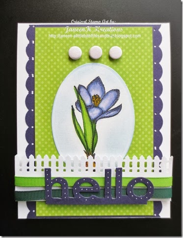
Remember the crocus?  With this single crocus, I thought it would be nice to show a fenced little garden.   Using all the same “ingredients” as Stamps #57 & #58 you get an entirely different look.  A couple of different punches, a top folding card and a bold greeting change this up a lot.  The Hello die actually cuts in all separate letters but I wanted it to be together and I very carefully lined it up on my cardstock and VERY carefully ran it partially through the Big Shot and then I performed surgery with an Exacto blade to trim the parts I didn’t want.  It was a bigger job than I thought it was going to be but I love the look and would do it again; just knowing that it’s going to take a bit of time as all surgeries do!   Smile

SUPPLIES:

IMAGES: Mark’s Finest Papers~Crocus in Winter

PUNCHES: Martha Stewart Fence

DIES: MFT oval stax~EK Success Border~Happy Hellos

RIBBONS: SU

EMBELLISHMENTS: Candies

COLOR MEDIUM: Copics

INKS: Encore Metallic Blue

Sakura White Gel Pen

Thursday, January 23, 2014

Piggy Bank #81 & 82

Here’s the left over tag from the one I made a week or so ago.  When I do make a mess like dragging a tag through my gelato mess I make a couple of tags for future use.  The color gets much more subtle as you continue to drag tags through the puddles.

I’ve been wanting to use this cute little Pure Innocence image with her piggy bank.  It worked great for the tag.  I added a touch of wood grain for the border of the tag and spring flowers for ribbon.  I had that left over scallop cut lying on the desk and it blended nicely with the tag too, like a little fence in the back ground.  I am entering this in the Mod Squad challenge to use Wood Grain. I used a Sizzix wood grain embossing folder too. IMG_3529 This also fits the Simon Says Funny Greetings Challenge.

SUPPLIES:

IMAGES:  MFT~Piggy Bank & By the Numbers

DIES: MFT ~ Double Scallop

TAG: The Paper Studio

RIBBON: The Paper Studio

EMBOSSING FOLDER: Sizzix Tim Holtz

COLOR MEDIUM: COPICS

MFTWSC SKETCH 160 and Stamps 78, 79 & 80

IMG_3528MFTWSC160Using the My Favorite Things Sketch Challenge for the week I colored up this little gal.  Entire card is made from scraps except for the base.  I love USING IT UP.   Don’t tell anyone but underneath the little girl is an oval hole shape cut out from a die cut.  But she covers it up nicely, don’t you think?  I cut the scallop border to soften all the geometrics gong on and added Viva pearl pen drops to it.  The washi tape carries the dotted look across.  I ran my paper ribbon through an ebossing folder for some Happy Birthday music.  Stamped the sentiment onto the pink circle and added a little birdie with teeny music notes.  I love water coloring.

SUPPLIES: IMAGE~MFT- PI Chrysanthemum-By the Numbers music notes & sentiments~Prickley Pear bird

DIES:  BLUEPRINTS 1 & 3

EMBOSSING FOLDER: Sizzix Music

COLORING MEDIUM ~Staedler Water color pencils on Michaels papers, Wink of Stella added to flower

Viva Pearl Pen in Icy White

Wednesday, January 22, 2014

Sympathy 74

These will run a bit out of order as I am posting ahead for when I am gone and still want to post a daily made card too.  I am in the process of making several cards for an order that came in.  You will see quite a few sympathy cards that will be going to a gift shop.  I have rarely used this set of SU flowers as it was a set given to me by my daughter’s mother-in-law when she got out of the stamping mode.  So not really my style but I do like the way this one stamped.  It has to be stamped in color to make it stand out.  If you use black it’s too much line and not enough detail that shows.  I stamped it in Olive green and then colored it with SU markers and a blender pen.  I mixed a couple of the pinks together on my craft mat and then just applied with the blender pen. A mat in a bit darker shade than the olive and a ribbon from SU that matched the rose perfectly.  I almost put that sentiment in the give away box the other day.  It is a cube and rarely gets used, however it was perfect for this, and so it stays.  Sigh….it’s so hard to let go of things.  Using a Viva Pearl pen in Salmon to up the elegance a little and there you have a nice card.  I guess I gave all the details in the write up and saving myself some time that’s going to be the list for this gem.  Thanks for stopping by. 

IMG_3523

Tuesday, January 21, 2014

Stamp # 69 Iris Sympathy SOLD

So I am in love with Gina K Stamps.  Look how beautiful they stamp out.  Yah, you gotta use a Stamp-a-ma-jig for placement but they stamp so beautifully it’s worth the extra time.   I first cut the negative part of the die out of the mauve cardstock.  Then used FROG tape to cover the opening.  I markered the stamp with colors and used the thumping technique on the stems and leaves.  Then I stamped on the purple.  Using my Stamp-a-ma-jig I lined up the flowers and stamped the entire image again on the white piece after reinking the stamp.  Put twenty dimensionals on the back to pop it up a bit off the white.  Added the ribbon and stamped on it with Staz-on  and then added a few dainty pearls with Viva Pearl Pen.  I love everything about this card.

IMG_3517 (598x800)

SUPPLIES:

IMAGE: GKD ~ Springtime Silhouette~ Sentiment MFP ~ Marsh Birds

INKS: SU and Staz-on

RIBBON: Mark’s Finest Papers

EMBELLISHMENT: Viva Pearl Pen in ice white

DIES: Spellbinders fancy tags

#68 Sunset Finch

Two cards for you today.  This is how you can make a nice card and then how to bump it up a notch.  Using all the same materials with the addition of a punch you get a more intricate design.

IMG_3516 (800x600)

IMG_3515 (800x600)

SUPPLIES:

IMAGE: Gina K Designs~ Winter Birds and sentiment

INKS: Spectrum

DIES:  MFT ~brand and leaves

PUNCH: FISKARS ~Shell Photo Corners

Sympathy #66 Blue Jay


You can’t go wrong with Gina K Design stamps. I haven’t tried any of her clear ones yet but they sure are on my Wish List.  The high quality rubber just stamps so beautifully.  I entered this into the challenge on the StampTV site.  The challenge was to make it sparkly.  Those little red rhinestones came in handy.  My drawer of that kind of bling is finally seeing a dent.  This was the last of those little bling flowers.  That makes me sad.  Someone asked me if I buy things and then don’t use them because I am saving them for a special person or special card?  Uhm, yeah I have been in that mode a long time ago but I now feel each card I make is special and for someone special so USE IT UP.

IMG_3508 (674x800)

SUPPLIES:

IMAGE: Gina K Designs~ Winter Wings and sentiment is from same set

EMBOSSING FOLDER: SIZZIX TIME HOLTZ~Wood Graind

DIES: MFT~Sentiment Strips~Spellbinders Small Ovals

DP: Paper Studio ~ Pocket full of Posies

INKS: Ranger Distress Ink Broken China

COLOR MEDIUM: Copics

Sunday, January 19, 2014

Celebrate Color Challenge~Stamp #65

SplitCoastStampers forum gives all kinds of ideas that give me jumping off points to start a card.  This one was the suggestion to use Turquoise, Teal and Coral all on one card.  Here’s another little Mark’s Finest Papers image that I won.   I get a lot of mileage out of this cupcake.  Maybe because I like ‘em so much???  Embarrassed smile  ~~I paper pieced the one cupcake and popped it up.  Colored the frosting a bit lighter and then used heat and stick and dazzling diamonds glitter on it. Do have one, Please!

IMG_3511

SUPPLIES:

IMAGE: Mark’s Finest Papers - Birthday Mini –MFT – DC Large Scale Back Ground

SENTIMENTS: inside and out -MFT Celebrate Big-

RIBBON: My Mind’s Eye “Party”~Scrap of seam binding

COLOR MEDIUM: SU Markers

SU Heat & Stick ~Dazzling Diamonds

#64 Glorious sky

those tag cards….I always like them on other peoples work but never could get motivated to use them, maybe it’s trying to stamp in such a confined space.  However, I do like to try new things and I did pick up these tags a month or so ago with the intention of using them.  The My Favorite Things Wednesday Sketch Challenge 159 was just the push I needed. 

As I was working I was struck with the thought of using warm and cool colors together.  That doesn’t usually happen as one has blues to cool and the other yellows  to warm things up.  But for some reason it worked on here.  Why? 

I used Ranger distress inks and swiped them on my craft mat, sprayed water on them and pulled the tag through.  All Warm colors.  I took the piece of designer paper and cut the scallops.  The DP is definitely a cool palette.  I warmed it up by distressing it with Tea Dye distress ink which kind of made the blue parts of the paper subtly pop.  (the cool parts of the paper) I added the gray strip on the top of the scallops because there is a lot of gray in the DP.  This seems kind of a warm gray with yellows in it and it looks cool like steel gray but blends nicely with the warm tones on the tag.   Oo-Oo~I scored on these decorative brad tags at Michaels after Christmas, like a sixty seven cents score for the whole package.  Yeah, I scooped up a few of them.  That little tag fit perfectly with the colors I used and now I have another Holiday card made ahead.  I am so going to be ready this year when the holidays roll around again.  ~now what to do with this pretty tag I have made.  I liked this pretty cool green color card stock, after I ran it through the Big Shot with a scallop stencil, but it seemed to need something more.  I grabbed a piece of that same steel gray and stamped it with a wood grain Back ground stamp, angled the top two pieces and it was just the look I was hoping for. I popped the main tag up with dimensionals.

IMG_3510

SUPPLIES:

IMAGE: Mark’s Finest Papers~Peaceful Nuthatch~MFT Wood Grain Back Ground

DP: Paper Studio~pocket full of posies

STENCIL: My Favorite Things Scallops

DIES: MFT Blueprints 3 & 6 & KwikKutz flourish

TAGS: Paper Studio

EMBELLISHMENT TAG: My Minds Eye

Saturday, January 18, 2014

Center Step Card Stamp #63

IMG_3505

IMG_3507

This was a new challenge for me.  I have never made a center step card before. This went together very easily with Patty’s instructions from this video.  I stamped in Versafine and then embossed with clear embossing powder.  Next, I added the flower soft to the flowers already printed on the designer paper. I taped both pieces to the base, stamped the spirals and added a die cut button and red twine.

I am entering this in these challenges.  Mark’s Finest Papers #195 is to make a center step card and the Mod Squad is to use snow

This nuthatch is a sweet image. This is how my cone flowers look once we get the first snow.  They are so pretty with their snow caps and then the little nuthatch flies in and picks the seeds.

SUPPLIES;

IMAGE; Mark’s Finest Papers ~Peaceful Nuthatch ~Sentiments are from same set

PAPERS: The Paper Studio ~Pocket full of Posies

DIES; My Favorite Things Blueprints 6

Twine

Flower Soft

I don’t know whose images the spirals are

59, 60, 61,62 ~ Flourishes and Frame

IMG_3502
This set was the very first set I ever won for entering into a challenge.  Oh my, it opened up a whole new world to me.  I have used and re-used this set with the pretty flourishes in many different colors.
Edith is my 96 year old friend stamping buddy.  She is amazing.  She makes beautiful cards for all of her children, grands and great grands and she has a pile of ‘em.  The also makes cards for all her nieces and nephews and her friends.  We never fail to receive birthday cards and anniversary cards from Edith. ~ This was the beginning of spring and I went to visit her and it was warm enough to eat outside.  Lots of times we’ll have a bite of lunch together or just a treat of something sweet and something to drink.  We were both glad to be warm enough to be outside.
I will send this card to her so that she receives some happy mail in her mail box during these long winter days.
Inside and outside of this card I used all the image stamps from this set. IMG_3503
SUPPLIES:
IMAGES:  Mark’s Finest Papers Flourishes and Frames (retired)
INKS;  Staz-on, VersaFine and Hero Arts Shadow Ink –stone
SENTIMENT: Celebrate BIG
DIES: MFT  Oval Stax
White gel pen

Springs Promise Stamp #58

IMG_3501

Ah, the crocus, how we look for them to poke their little shots through in the spring.  I have planted many of these little bulbs but only a few have survived the chipmunks and squirrels digging them up in the fall.   This stamp set has another image with it that is a single crocus and is stamp #57 but it is winging it’s way to a friend and I won’t be able to post it for a couple of days yet.  (watch for it)

Sometimes when stamping similar images the first card is a jumping off point and leads to something a bit more detail.  I love the springy look of this card.

SUPPLIES:

IMAGE: Mark’s Finest Papers-Winter Crocus~Judith Dots on a stick

PUNCHES: Martha Stewart

RIBBONS: SU & Hobby Lobby Christmas Collection


INKS: SU –Summer Sun-Cameo Coral~Ranger Victorian Velvet Distress on butterfly

EMBELLISHMENTS: Candies

COLOR MEDIUM: Copics

Friday, January 17, 2014

Simple Masculine #54

This unused image from Mark’s Finest Papers is so peaceful.  I stamped it in gold metallic on black to set it off.  I thought about embossing it but something said, No, it would lose the detail.  This turned out very CAS which is not usually my style and likely the reason I added the punched corners but I love the way they look on there to kind of ground out the white space.  The soft brown is the color of deer here in the winter season.  This card fits the Monday Challenge at Simon Says Stamp of Anything Goes.
IMG_3491
SUPPLIES: MFP-Cardinals in Winter
INK: Encore-metallic in Champagne
RIBBON: The Paper Studio-Frayed Canvas
PUNCH: SU
Brads: unknown source from JoAnn Fabrics
Technorati Tags: ,,,

Cardinals in Winter #55 & 56

IMG_3495

IMG_3496Finishing up the Cardinals in Winter set.  Oh this is definitely a keeper set.  I love birds and up here in the North woods where there is so much white space in the winter they are a welcome site in our pine trees.  I am entering this into Simon Says Emboss It Wednesday challenge for this week.  It’s a simple card with lots of WoW to it.  To create depth to the frame, I ran two pieces of cardstock through the Big shot.  I stamped directly on one piece and then used an oval die to cut out the second piece. I then ran a black marker around the inside of the oval to make it stand out a bit more against the white. Next step was to line the two pieces up and glue them together.  Layer onto mats and there you have it.

I used the smaller stamp on the inside of the card as a shadow image to tie inside and outside together a bit.

SUPPLIES:

IMAGE: Mark’s Finest Papers: Cardinals in Winter-Outside sentiment is also MFP from Flourishes set. Inside is retired SU sentiment

Cuttlebug Embossing Folder –Scrollwork

COLOR MEDIUM: Staedler Water Color Pencils and Tombow Blender Pen

EMBELLISHMENTS:  Candies

DIES: My Favorite Things Oval Stax 1